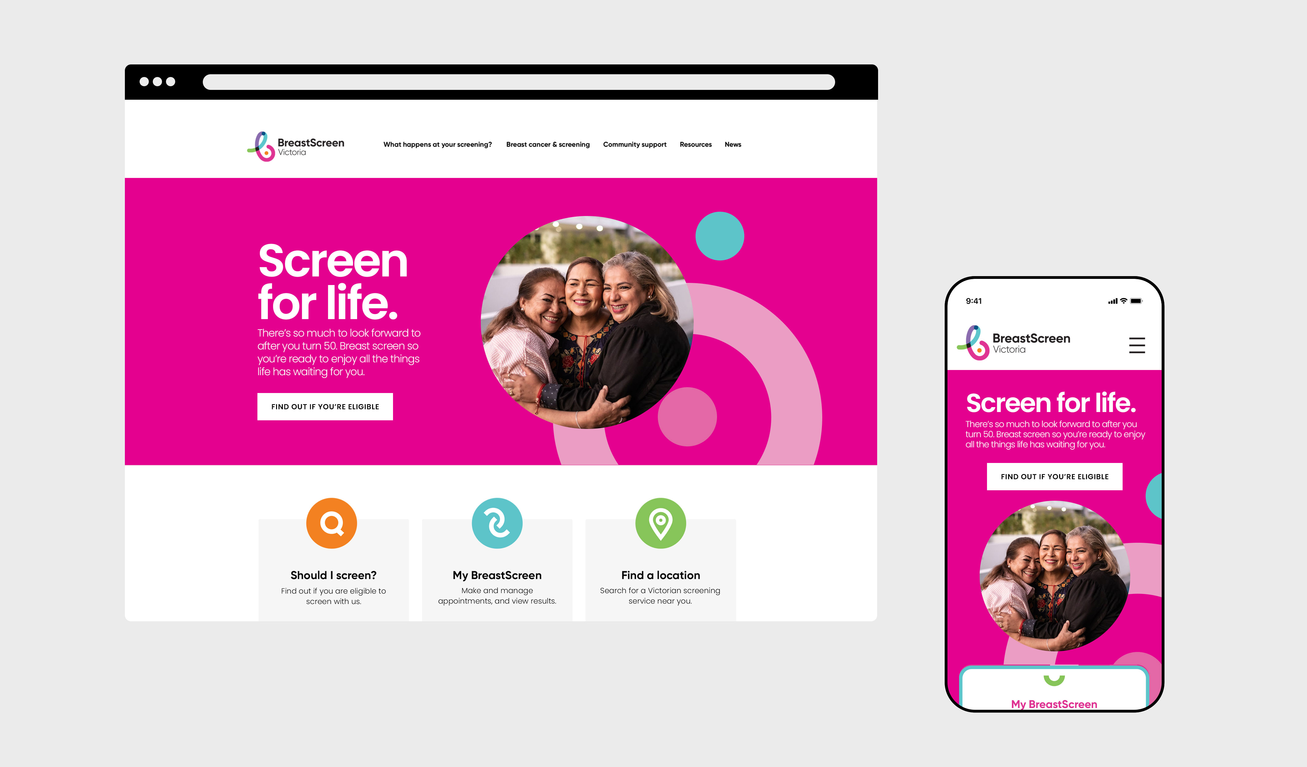
BreastScreen Victoria’s purpose as a population screening program, is to reduce the impact of breast cancer and save lives through early detection. The goal for this rebrand was to evolve BreastScreen Victoria’s current visual language whilst retaining core values of diversity and community. It is tonally optimistic and energetic, encouraging individuals to be proactive and take charge of their health in a process that is simple and
un-intimidating. Key imagery features photographs of diverse, confident individuals, inspiring bravery and creating positive associations around breast screening.

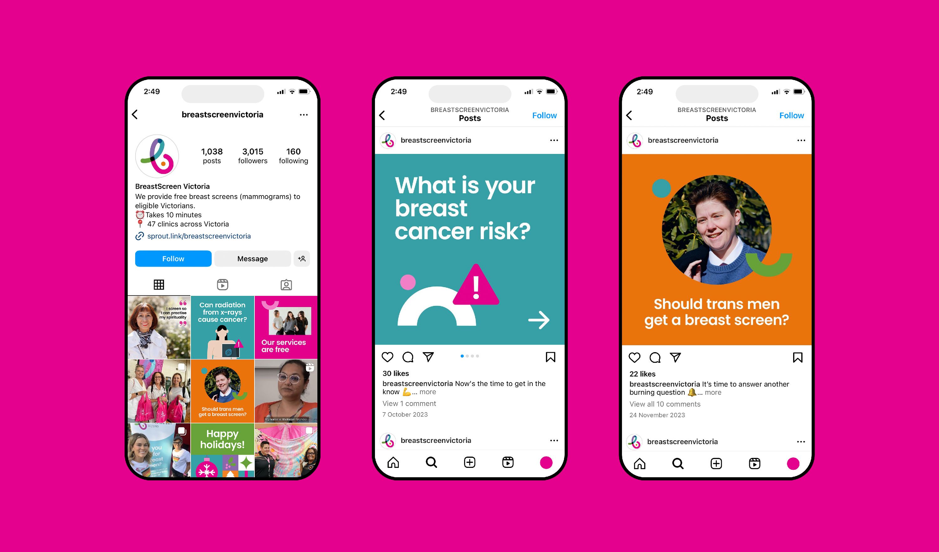
By extension, a bespoke library of illustrations were developed for specific use across BreastScreen Victoria’s social media assets. The characters are stylised with simple geometric forms, establishing a flexible and contemporary illustration system.